Thursday, October 28, 2010
Edge
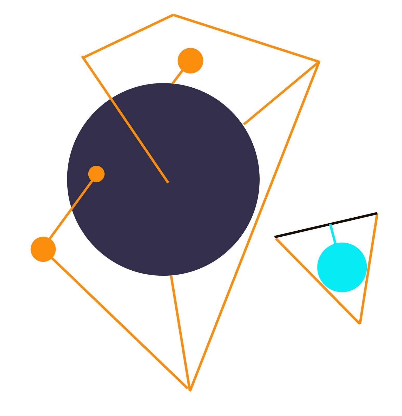
Take away most of the sharp edges but still leave edges distinct, no blending. Use spatial effect for multiple focal points to varying degrees.
Tuesday, October 26, 2010
Audience Considerations

Closed in verses relatively open...

Feeling like your on the tail of the curve.
I worked on mutable forms again today (when not doodling as above), playing with varied arrangement, me in the studio, without an audience. I like what I see. That doesn't mean every or any audience will.
There can be a disconnect ... because the work does not quite come together (like at ArtPrize, though I think I disliked my piece more than did viewers), or it does work yet is perceived differently by viewers. Without connecting, the artwork's validity rests with the artist as creator. I think that's one of the reasons making art can feel lonely. When the work does connect and communicate, even if the communication differs from the artist's intention -- one can see connection in people's faces when they look at the work -- the work extends past its creation and the artist.
Art sometimes gets appreciated and hawked merely for the apparent time its creation took, or the many multiples of materials that comprise the work. It's ironic to hear some criticize this appreciation as mass audience appeal -- a la some of the work that was in ArtPrize -- when time and accumulation find appreciation and approval in the higher art world, too. Time and accumulation are valid strategies, as are most strategies, if they result in work that connects aesthetically and conceptually and lasts beyond the initial novelty of the time expended or the pieces accumulated. If viewers keep thinking about the work, something got through.
Sunday, October 24, 2010
Experimenting in a Mess

I'm staring at a mess I have yet to start cleaning up. Sigh. The jumble in the room matches the jumble in my head at the moment; perhaps that's why I am resistant to clearing out the room. Something's gelling.
Saturday, October 23, 2010
More Ruminating


Time goes so quickly and almost always feels like it is running out.
One day, it will stop. Like that.
What will be left and does it matter?
Thursday, October 21, 2010


Wednesday, October 20, 2010
Sketch: shapes
 Thinking of framing, containment, aesthetic infinity verses fixed objectness today after reviewing some writings on Mondrian. Also thinking about how some artists shaped their image by destroying old work and writings.
Tuesday, October 19, 2010
Symbol Story
 Spent a long afternoon and evening of resizing images for submissions. Spent for now. So I ended up playing around with word processor characters to make characters, above.
Monday, October 18, 2010
Originality
 Reference: LasCaux caves, Bison
In a very loose sense, everything that comes after is somewhat derivative of what comes before; however, I like to think enough can be approached or done differently that what is current cannot be pigeon holed as little or no more than something that was past, even if the current incorporates, references, relies upon or in other ways uses history.
On the other hand, it's disappointing how well derivative artwork can do and also disappointing how what seemed original quickly no longer is, if ever it was novel.
Sunday, October 17, 2010
Frame

The top corner edges underscore that this image was created and continues to sit within a rectangle.
Reference
 This burned plastic work is by Alberto Burri is from this site on Italy, including Italian painters.
 This work from findartinfo.com is one of Piero Manzoni's AChrome pieces. See also this site dedicated to him.
Saturday, October 16, 2010

Friday, October 15, 2010

Accumulation
Some art making accumulation strategies that repeatedly seem to get used ...
-Accumulation into amorphous form
-Scattered accumulation
-Gridded accumulation
-Accumulated pixels
-Accumulated viewer scribblings, comments, doodles, etc. on a provided surface (straight forward, lo tech interaction).
-Accumulation into amorphous form
-Scattered accumulation
-Gridded accumulation
-Accumulated pixels
-Accumulated viewer scribblings, comments, doodles, etc. on a provided surface (straight forward, lo tech interaction).
Thursday, October 14, 2010
Hovering Near Precision

Fred Sandback's work, an example shown above from an exhibition at David Zwirner, creates a memorable visual impression and experience out of such simplicity. Good to strive for that level of precision and trust in its impact.
Precision is neither necessarily additive (knowing when to stop) nor subtractive (knowing when to pull back). One could arrive there from either direction. It's interesting to think about occupying the very narrow range just over and just under the point of perfect demarcation, hoping to arrive, overshooting, pulling back, standing still in the clearing haze. And then, to think of leaping as far out or back as possible, disrupting any sense of eventual balance.
Wednesday, October 13, 2010
Submissions
Today, I worked on proposals and submissions, a seemingly endless process of resizing images to meet the specifications of each, and wished a standard format could be adopted.
Beyond the mechanics, the submission process affords a reason to assess past and current work, to research context, and to delineate direction going forward.
Beyond the mechanics, the submission process affords a reason to assess past and current work, to research context, and to delineate direction going forward.
Tuesday, October 12, 2010
more formal play


further thought ... the crossed circle could become a sphere into the space behind the line, but not like this.

Formal Play
 Metaphor: Possibility, Restraint, Breach, Recovery
A flat circle capable of being a sphere loses that capability to a line until filling in the color mass below and above expands the two hemispheres, still constrained/restrained at the center; once close to fully filled in with color, the shape once a circle hovers near the possibility of again being able to be a sphere.
Monday, October 11, 2010
Passing thoughts on material use.
Inspired, yet still troubled. Material is too easily a fad.
Recreate a landfill mound without any dirt, so one can see what lies inside beneath the dirt, some of it biodegradable, much of it not. That which isn't biodegradable is a structure; that which is rots away. It's the rot we want, the decay that is healthy, not the imposed random structure.
Recreate a thick dust cloud within a transparent balloon, gravity strangely sinking the cloud down toward the ground, lightness defied.
But if re-creating an object or phenomena is the goal, it's restrictive: scope ends with the re-creation. Is everything real and fake?
Sunday, October 10, 2010


Saturday, October 9, 2010
Thinking about what is "defining" and what is "relevant"


Essential: Gravity. Space. Differentiation among elements. Prior identity. Points of departure. Discovery. Present/Monumental. Lyricism. Light/Shadow. Integration. [Try to reduce this to three].
Relevant: Separating line and area/volume. Transparency. Color accumulation. The wall. Four walls. Level of transformation. Scale. Presence different than inspection. Stopping point/vacillation.
Irrelevant: Clarity, representation,
Undecided: Material, randomness, accident, figurative, narrative
Opposing: Mass amalgamation, linear, message delivery.
Wednesday, October 6, 2010
Gimmick, Trend and Forgetting About All That.
Art is hard.
It is a giant flashing indicator of too much isolation from what else is going on and being shown when one pauses and realizes how quickly trend can overtake what starts out as unique and novel and warp it, making it feel like a gimmick, or worse, derivative, even if it isn't either. Hovering work near without touching gimmick just might be feasible and interesting -- because of the tension -- but a few days/weeks/months later, such hovering work would probably sit well inside the gimmick camp.
I am done for now worrying about the gimmick effect in the use of some non-art materials -- and how widespread such uses seems to be becoming. It isn't the materials themselves that matter, it's why and how you use them and what you say with them. Either that works and is appreciated or it doesn't and isn't -- the difference between what might be relevant and what is defining.
I had a good few hours creating new work today. Getting back to playing.
Risking Failure
At my presentation yesterday, I shared my thoughts on the failure of my Artprize piece. Liberating. While one would rather fail in private and toss out the bad work or rework it until it managed to succeed, I am glad I risked failure.
I went to look at the piece before the presentations. It had deteriorated more from the weather, but it did not bother me the way it did as I was struggling with making it.
I went to look at the piece before the presentations. It had deteriorated more from the weather, but it did not bother me the way it did as I was struggling with making it.
Monday, October 4, 2010
Upcoming Presentation, and more on the dreaded "Gimmick" potential
I present my art tomorrow at Grand Rapids Community College, along with three other Artprize artists with work at GRCC for Artprize. Three out of four of us speaking are using recycled or re-purposed materials. So, again, I'm wondering if my work is too inside a trend, just due to the numbers and not the content of these other artists' work. I look forward to their presentations.
Some consternation comes from a recently rejected submission. One never quite gets used to rejection, even if one "knows" acceptance/rejection can depend on a lot of factors, not the least of which is juror "taste." My piece was made of ephemeral materials, although that may have nothing to do with its rejection as the show may turn out to be filled with predominantly ephemeral work, given the material trend that keeps popping up when I look around these days. The piece was not fully realized -- it was a proposal with a sample rather than a final work, which may have been a wrong approach for this particular exhibition. Or again, the exhibition may turn out to be filled with realized "proposed" works; my "sample" and write up may itself not have been sufficiently realized. Or the jurors disliked the concept, compared to the works they selected. Or. Or. Or. I think the concept is good; so, I'll have to work on it more, and create more samples to present a better basis for visualization the next time I submit.
When I look at the work on my studio wall, the direction looks strong, though individual pieces need more development. And it looks different, for the moment, from what I see out in the world. This can't be a bad thing.
Friday, October 1, 2010
More Thinking About Material
Devastating thought, sort of... I may be the only one who shares my aesthetic. I'm grumpy. And a piece fell off the wall when I was taking pictures, which made me grumpier. Still, lately, I keep having this concern about being too singular.
I watched Artprize's Critical Discourse over the Internet tonight. Panelists and an audience discussed the ten pieces selected as finalists. The discussion led me back to evaluating non-art materials in art: the moderator started with a "contextual" bit about a drawing of a cosmetics model in a private collection in Napa Valley (I missed the artist's name), made from cosmetics and kept in a room imbued with the scent of cosmetics. Hits multiple senses hard with non-art material. The cosmetics theoretically at least were used aesthetically, materially and conceptually. The "painting" -- that's what the art looked like in the slide -- did not appeal to me; everything, if anything, about the "painting" seemed to come from its "cosmetics" shtick. I looked up art with cosmetics on Google and came across another "cosmetics" artist (I don't think it was the same as the rendering did not look as the slide shown in the discussion). Bottom line, anything one can think of probably has been used as a material, but does the "art" in which the material is used need the "material," verses plain old paint or clay or wax or metal or glass, etc., or does the art transcend the use of the material.
Fiber is an art material, but can be used in unexpected ways. My favorite top 10 Artprize piece (I hope it wins) -- the simply elegant suspended threaded red disks by the installation artist from Texas (need to look up her name) did transcend material and process -- the piece when viewed did not feel like it was about the "material" per se -- though the narrative of the art suggests the material was conceptually integral. I cannot recall if the threads connected to one another at all, consistently or inconsistently with the narrative. A small question comes to mind, however: Is it possible to make this kind of suspended display in a way that is not aesthetically pleasing? Undoubtedly. [Update: even if it were not, perhaps that is the brilliance of the piece.] Is it easier or harder, assuming intentionality, to make such mono-colored suspensions pleasing than non-pleasing? There's a choice in making it comfortable, inviting, relatively uniform, visually pleasing, etc. rather than ominous or uncomfortable or incongruous or difficult on the eye. It's interesting to note that the artist had planned for viewers to be able to walk through the piece, with the disks closer to floor level, and make a wave -- that would have added non-visual sensation, as well as another visual dimension, to the experience of the piece.
Subscribe to:
Posts (Atom)